The country Britain not only stands against terrorism and discrimination but also fights against those issues to protect society.
The Prevent Strategy was set up in 2006 by the government to stop people supporting terrorism or becoming terrorists.
The strategy is subdivided in three major aspects which are challenging the ideology that stands for terrorism, protecting innocent people and supporting those sectors which have a risk of radicalization.
To prevent that young adults or even children turn into terrorists the government developed the Equality Act in 2010 which tackles inequality and prevents discrimination against people with 'protected characteristics' inside public schools. Examples for 'protected characteristics' are the age, disability, sex or sexual orientation, the religion, etcetera.
In fact of that the British Values are defined as "democracy, the rule of law, individual liberty and mutual respect and tolerance for those with different faiths and beliefs."
(Isaac Harvey, 2015)
Afterwards I looked at some designs from others which refer to the theme. I got inspired by typographic images as well as the simplicity and diversity of other designs. Each of them had its own character and represents one aspect wich individual liberty includes.
(RockingMrE, 2013) (Kingsbury School)
(SWEAPON, 2010)
Starting with my image I brainstormed my ideas by looking at the word INDIVIDUAL at first. When I conceive of individual I think about 'difference', 'singular', 'unique' and 'determined'. Therefore I looked at some figure images that seem to know what they want. Some of the bodies I chose are going in one direction. Because I wanted to refer to both sexes I used a blank white figure.
The former designs inspired me by thinking of something simple, including the British flag and using typography to response to the British Value.
 My first design idea was to create a typographic image which expresses liberty through the layout and font of my words. I used a cursive font which conveys the feeling of individuality that dissolves in the end and turns into birds which fly away. Because of that it raises the expression of freedom and unconventionality. To underline those concepts I used a photograph of the sky above the clouds so it seems that the birds are flying to the sun into the infinity.
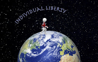
I liked my outcome but I also wanted to experiment with images instead of words to come up with a visual response. In that fact I thought about a human going on top of the globe holding a British flag in its hand. I used a colorful and abstract demonstration of the earth which demonstrates the diversity and individuality. The words "Individual Liberty" also reflect those colours. The human is going straight in one direction. That expresses the human's liberty which is also the reason for a black artificial sky with stars. Because it is only one figure it stresses the fact of an individual. The British flag refers to the British values.
To look at my outcome I think it looks too cheesy and surreal for demonstrating individual liberty. Because of the fact that the British values are used in the country I thought of reorganizing my ideas and transferring them into a more realistic design.
I wanted to stick to my idea of a human walking on the world because I like the message behind that image. Therefore I used a realistic sky with stars as background, an image of the world and blue letters with white contours. The colour of those words connect with the colour of the earth. Blue also stresses the fact of infinity.
I experimented how to involve the British flag by leaving it as a flag to carry and by creating a shirt for the figure. I liked the first outcome better because in that the figure looks more determined.
After comparing my outcomes I figured out that I like the more realistic image with the person holding the flag the most because it expresses the British values already applies to Britain's society.
In conclusion I learned a lot about Britains view of terrorism. The fact that Britain tries to prevent terrorism and protect its society by setting up the Prevent Strategy and the Equality Act 2010 was new to me.
I think that this task is really important to understand and gain knowledge about the British Values and the importance to uphold it in future times.
I also like my outcomes and their meanings. I think that they are good responses to individual liberty and convey the powerful significance of it.


Kommentare
Kommentar veröffentlichen