I thought about designing
a graphic campaign about the known issue of women and their
appearance.
At first it was hard for
me to decide on a topic on which I want to base my project but after
a while I thought that beauty ideals affect almost every women
just as me. So I decided on going for a protest campaign against the
“perfect” looking woman.

Regarding to that theme I researched the change of the perfect body shape for the last 100 years.
To beginn with the 1910s century the "Gibson girl" were seen as the beauty ideals for the women's body. For instanc Camille Clifford.

In the 1920s century the "falpper girls" became more beautyful. Alice Joyce became a role model during that time.

After ten more years people admired curves again because those girls were seen as the "sex siren". For example the movie star Jean who was nicknamed the "Blond Bombshell".

The 1940s century had the beauty ideal of women who cheer returning soliders from the war. Katherine Hepburn defined the role of the "40's Screen Queen".

Marilyn Monroe became one of the sex symbols of he 1950s. People liked her curves as those look feminine.

The 1960s admired the "petite" with their super skinny figure. One of the most famous supermodels was Twiggy.

Ten years later women with wider shoulders and thin hips became the beauty ideal for everyone like the dancing queen Farrah Fawcett.

In the 1980s century the bodies of the "supermodel" looking athletic and having long legs were seen as perfect shaped. One of these models was Elle MacPherson.

After that the models became more skinnier and started looking androgynous just as Kate Moss.

The 2000s century started to build up a new kind of perfect by women who are tanned like Christina Aguilera.

The recent century admires women with thin hips and big buttocks. For instance Nicki Minaj.
Starting my project with a
lot of different questions based on that topic I switched between
German and English so I had various phrases I could
choose from.
I also learned that the quote by itself is not the most important thing about typography. More important is how to express my context using the right shape and font for my words.
I wanted to have a question as my main image because people reading that get involved better by thinking about the answer of the question. Based on that they would memorize my campaign.

I decided to pick the
question “is your size the most important thing about you?”.
After that I figured out that I could add to the questions “shape”
and “weight” so I would ended up with three different phrases on
three different posters which would convey the same topic and would represent my campaign.
“is your size the most
important thing about you?”
“is your weight the most
important thing about you?”
“is your shape the most
important thing about you?”
Before I started with
illustrating my words I looked at some typographers to get a better
understanding of how I am going to transfer the words into images
which would convey my topic the best.
 Jeff Harder's work shows
the back of a car especially one wheel which is formed out of words.
I really liked the idea of having words instead of actual painted
lines.
Jeff Harder's work shows
the back of a car especially one wheel which is formed out of words.
I really liked the idea of having words instead of actual painted
lines.
Josef Müller Brockman
uses simple colours just as red and black to illustrate a whole
object. Because his posters are arranged very clear by colours the viewer
knows the poster's topic since the first second.
 I also liked the work of
the typographer Neville Brody who expresses movement with his words
which do not have a order.
I also liked the work of
the typographer Neville Brody who expresses movement with his words
which do not have a order.

The bright colours of Saul
Bass' posters are an eye catcher which I thought about having too in
my own work.
After I got inspired by
famous typographers I started thinking about how to convey my themes by using my questions as words.
I really liked the idea of having square posters because they are unusual and when you look at them they do not seem to show the whole picture. So that format would fit perfectly to my topic that the woman's body is not everything that a woman has.
I really liked the idea of having square posters because they are unusual and when you look at them they do not seem to show the whole picture. So that format would fit perfectly to my topic that the woman's body is not everything that a woman has.
Weight is measured by
scales so I was thinking about constructing a scale using the letters
of the question. Jeff Harder inspired me to actually use the words
instead of unnecessary lines. I also looked up three different photos
of scales. One analogue and two digital scales. Then I looked at
graphic designed scales from the Vector Illustration which are also
one analogue and one digital scale. Based on that I came up with
three different images.

 I decided to go for the
simple scale which has the text written as the outside of the circle
and has a hand pointing to the word “weight”.
I decided to go for the
simple scale which has the text written as the outside of the circle
and has a hand pointing to the word “weight”.
Then I developed my scale
so I tried some other shapes and already colours.
I started writing other
character traits that a women could have on the side instead of
numbers and the question as the inner circle.
To find those character
traits I ask different girls the question: “What character trait
would you like to have if you could choose?”. Most of the girls
were telling me they would like to be funny, intelligent, charming,
humorous or smart.
Because I liked my design I thought about the colour.
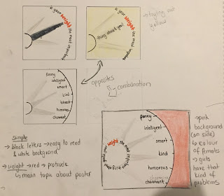 My posters should be easy
to read and clear. Therefore I wrote the letters in black and
coloured the scale in white.
My posters should be easy
to read and clear. Therefore I wrote the letters in black and
coloured the scale in white.
 My posters should be easy
to read and clear. Therefore I wrote the letters in black and
coloured the scale in white.
My posters should be easy
to read and clear. Therefore I wrote the letters in black and
coloured the scale in white.
To highlight the word
“weight” which is the keyword in this quote I draw it in red.
In addition is red usually used to point out things which are outside the framework of anything.
In addition is red usually used to point out things which are outside the framework of anything.
I got inspired to use a
bright colour by Bass.
Furthermore I thought
about the audience of my campaign which are mainly women. Therefore I
looked online for “colour pallet girls”. The colour pink came up
in different variations. Therefore I painted the background next to
the scale in pink.
The font should be a
little bit wavy but readable so it would also look feminine.

After that I started my
next poster. Because of the fact that all three posters are one
campaign I kept it simple with the same colours and font.
My second question is “is
your shape the most important thing about you?”.
Based on that I looked at
different sized models, one skinny model and the other an oversized
model. Next to the picture I wrote down some questions which came to
my mind like “Does everybody should look alike?” and “Who has
the perfect body shape?”. I also looked at the standard women body shape.


To illustrate the shape I
drafted some images with simple lines so I could easily replace the
lines with words. Afterwards I asked other people what they would see
so I could find out if my image is clear and if they recognise in the shape
of the words a women's body.
Most people could identify my sketches especially the first one (chest and waist) and
the one under it (whole body).

But because I liked the
curve of the other images better I decided to develop those into a
shape of hips and waist. The group discussion helped me to come up with this idea. Then I asked people around me again and
everybody liked that image the most, too.

My third poster should
demonstrate the issue of a woman's size. To measure a woman you need
a tape measure. That led me to look up a tape measure photography.
I also looked at a size chart and ask myself why everybody tries to have the size extra small or small.
I also looked at a size chart and ask myself why everybody tries to have the size extra small or small.

Then I outlined a tape measure which goes from the one side of the image to the other by having one circle because it should look like a tape which measures a woman.
I also added the colours
and font so it would be included in the campaign.


After finishing my
sketches and after finding out what I want to design in detail I
started creating the scale with Adobe Illustrator.
I choose to design my
campaign with Illustrator because I have never used it before and
because I wanted my photos to look clear and a kind of empty. My
theme was less image/text means more meaning/ feelings.
While designing the scale
on screen I developed my idea further.
I tried to put first just
one pointer and then more pointers in different grey colours on the
scale. The grey tones should symbolize that the pointer is moving and
that it does not matter on which character trait it points.

But I thought that too
many pointer would be confusing so I decided to just have one pointer
in a dark grey which is not as dominant as a black one.
I also thought after
designing the scale that it was harder to recognise than I expected
it would be so I added some little lines on the side to make it look
more like a scale.
My next design is the body
shape poster. I draw one curvy line and used the question for the
other side so the shape would look like a women silhouette. Then I
draw two lines to separate the legs and coloured the background
afterwards.
After that I copied the
question and put it again on the other side so the body shape would be framed by words. When I compared both posters I liked the original
one better because it looks more elegant and clear.

Later I designed my Size poster which was the most difficult design for me because I had to create different lines with Illustrator so the question would be written inside the white gab.
I also had to come up with
the idea to add some lines to measure because the poster was not easy
to recognise.
I tried different options
and ended up with wide gabs between light thin grey lines.

In the end I thought about
the local placement of my campaign and how they are going to be
presented together.
I choose to place them on
the underground because there they would be seen from a lot of
different women. Therefore they should be placed next to each other
because when people would pass them they would recognise them better.

Also if women see the first poster they would recognise the topic. By passing the second and third they would remember them better and start thinking about them afterwards.

Also if women see the first poster they would recognise the topic. By passing the second and third they would remember them better and start thinking about them afterwards.
I also thought about the
order of the individual ones. The first one should be the scale, the
second poster the body and the last one the tape measure. That is
because the woman's body is the main image and topic of my campaign and therefore central and
because the body represents a human which measures its size with a
tape measure and its weight with a scale.

To summarize and evaluate
my work I think my outcome is successful because I designed a
campaign on the topic beauty ideals which is made out of three
different posters that harmony great together. I also used no
pictures but transferred the letters into images which are easily to
recognise.
In addition I learned how to work with Illustrator which I have not done before.
This was also my main problem because I had to learn the basics from some friends and also the software workshop.
In addition I learned how to work with Illustrator which I have not done before.
This was also my main problem because I had to learn the basics from some friends and also the software workshop.
I really like my campaign
but I think I could have gather more different ideas in the
beginning. I also could have designed more different images which
represent my topic so I could have choose from more.
Furthermore the lines
could be better drawn.
Kommentare
Kommentar veröffentlichen