The aim of this project is to create a Zine in collectives to learn how to communicate, find solutions and distribute jobs to come up with an amazing work.
First of all we shared our own collages and themes with our group members to find a new theme for our zine that is inspired by all of our work.
We combined our individual topics sexuality, politics, reality, networking and provocative in one zine.
For that we brainstormed our ideas. During this process each of us had the chance to share their thoughts with the others. It was a nice working atmosphere and therefore it was fun having conversations.
The idea of our zine is to divide it into sections that faces different topics that are based on the issue of how social media represents people. Regarding to that we want to reveal the images or writings and show the actual meaning of them.
The different sections are body images, sexist headlines, stereotypes, social media and immigration.
This thought led to the zine's name which is called EXPOSURE.
On the one side means exposure to reveal the actual meaning of media's images. On the other side is it a term for a camera setting which refers to our collages and the theme networking.
On the one side means exposure to reveal the actual meaning of media's images. On the other side is it a term for a camera setting which refers to our collages and the theme networking.
To help the reader understanding the content of Exposure we had to write a paragraph which bases on key questions that we had answered in our group before.

Afterwards all of us looked at the different jobs which are needed to create a zine without distractions and misunderstandings. As I read those categories I understood the process of creating a zine or magazine in a company better.
All of us could choose their own jobs without any complications. Each of us had to be an Illustrator respectively an image maker.
Additionally, I became one of the Designers that is responsible for the layout and arrangement of the whole zine. That means that I have to decide where to place the images and texts and in what font or style we are going to print our work. Furthermore I have to design the front or back cover of our magazine.
Additionally, I became one of the Designers that is responsible for the layout and arrangement of the whole zine. That means that I have to decide where to place the images and texts and in what font or style we are going to print our work. Furthermore I have to design the front or back cover of our magazine.
Because everybody in my collective is dedicated in this work we decided key things together so that everybody would have a voice in and be happy with our final outcome.
Starting with my job as an Illustrator I did some research on my section which is "sexist headlines".
I found different newspaper and magazine articles that exposes stars in their everyday lives.
The problem about social media is that they attract attention by embarrassing famous persons who do not have any privacy.
The media uses one shot and interprets something totally different in it without looking at the actual background why somebody did something or why he or she is wearing something.
The media uses one shot and interprets something totally different in it without looking at the actual background why somebody did something or why he or she is wearing something.
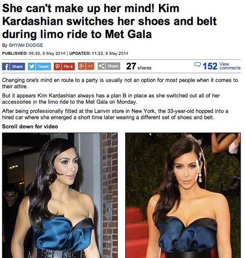


The first image that I designed response to the article from the newspaper "Daily Mail" that talks about Brexit or better manipulates such an important topic by using the sexism headline "Never mind Brexit, who won Legs-it".
My idea was to exaggerate the medias headline with an image that shows nude legs to underline the manipulation in this headline.
While doing that I used asymmetry in the digitalized collage and placed the text in one point of interest regarding to the rule of third so it would stand out. I used the digitalized collage to express that media is representing this image.
Furthermore I thought about simplicity and focusing on the real meaning of this headline.
Afterwards I printed my outcome in different colors to experiment with colours in view of the Risograph prints.

I like the simplicity of my outcome and that it conveys exactly what the newspaper's headline says. In addition it is made out of two colours which is good to convey into our final zine.
To exposure the real meaning of this image it becomes clear that Theresa May and Nicola Sturgeon talked about Brexit which is recently one of the most important political discussions.
The Daily Mail made a joke of it and talked instead about Brexit about May's and Sturgeon's legs. To express the actual topic of this conversation and the authority of both women I used a static and structured layout which seems to be stable.
To look at the collage it conveys the expression of concurrence between May and Sturgeon.
I also wanted to underline the fact of them having a lot of heated conversations by using an image of Sturgeons mouth.
To bring up the aspect of Brexit I used a background which shows half way the English flag and halfway the European flag.
To bring up the aspect of Brexit I used a background which shows half way the English flag and halfway the European flag.
To evaluate my outcome I think it conveys the issue of competition and Brexit well.
However, it could be more detailed.

To experiment and optimize my image I combined it with illustration and printed them in different colours. I paid attention to the fact that Theresa May is supporting Brexit which is seen on the England flag behind her and thatNicola Sturgeon still fights for the EU.


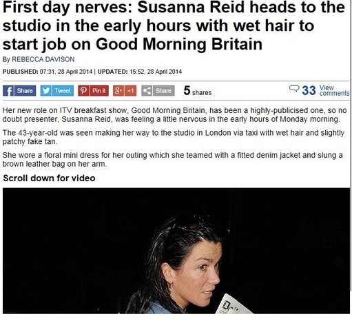
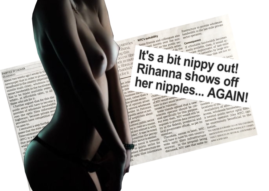
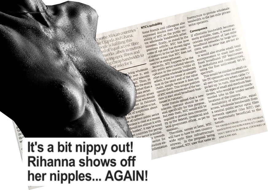
After that I started thinking about the sexism headline "It's a bit nippy out! Rihanna shows off her nipples… AGAIN!" which is written in the heat radio magazine.


After that I started thinking about the sexism headline "It's a bit nippy out! Rihanna shows off her nipples… AGAIN!" which is written in the heat radio magazine.
This article does not talk about Rihanna enjoying a basketball game with her friend in her free time but only focus on her "nipples".
To express a characterless feeling that cuts off Rihanna's personality and the environment in which she is, I thought about a digitalized collage that includes the chest of a woman, the headline and newspaper.
To come up with the best result I experiment with different layouts and images.
I wanted to stay simple to focus on the expressions of the headline.
I like the different layers of the outcome because they convey the order of importance which means that the most important image (headline) is in the front and the least important image (newspaper) is in the background.


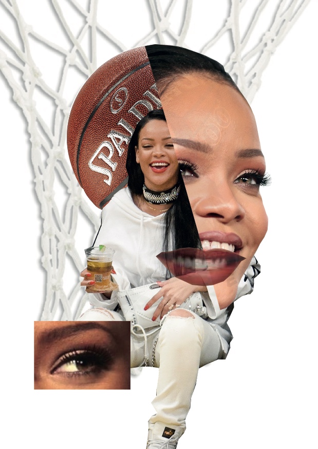
To exposure the real meaning of the image I focused on Rihanna as a person and on basketball because of her attending a basketball game in her free time.
To express these things I thought about creating a portrait of Rihanna using photographs which were taken at basketball games and photos in which she shows happiness as well as images that expresses the basketball atmosphere.
To express these things I thought about creating a portrait of Rihanna using photographs which were taken at basketball games and photos in which she shows happiness as well as images that expresses the basketball atmosphere.
The reader should get convinced that Rihanna is not looking for scandals and attention like the magazine portraits her but instead just like to watch a basketball game with one of her friends.
Therefore I used different layers that show her having fun.
I also added her smiling mouth to draw the attention to her happiness. The eye on the bottom conveys her interests in basketball.
To show the location at a basketball game I used a basketball net as background so it seems like she is directly involved in that came as well as a basketball which fulfills her head to underline the impressions.
Then I though about the words that would fit to the "real" situation. In fact of that used "Rihanna enjoying basketball" instead of the sexism headline "It's a bit nippy out! Rihanna shows off her nipples… AGAIN!".
After I looked at my outcomes I quit the words because the image should express those feelings instead of a simple text.
After I looked at my outcomes I quit the words because the image should express those feelings instead of a simple text.
To come up with a good collage I experimented with some images that are involved in that collage.
I think that I have a good outcome because it expresses the real meaning of Rhianna at a basketball game and does not criticize her. It shows that she loves to watch basketball in her free time and does not care about paparazzi.


After I finished my designs I looked at my job as a Designer. My duty is to design the back cover, arrange the layout and choose what type, font style, point size and pagination our zine would have. Because of the fact that my group has two designers we needed to decide those issues together.
But I started off with the back cover by thinking about our audience and what theme we are communicating in Exposure.
I came up with the thought that the back should look fancy because it is made for people from 16 years until the 30s. In addition it should include our Zines name so people would memorize it better. Furthermore and most important it has to convey the content of our zine namely the representation of people in the media.
Looking at those facts I came up with the idea of involving a mouth because information and representation are transferred by talking to each other.
Additionally, on the one side we see the news with our eyes but on the other side eyes do not lie. For these reasons I decided to create an image that also shows an eye.
Additionally, on the one side we see the news with our eyes but on the other side eyes do not lie. For these reasons I decided to create an image that also shows an eye.
In total the back should make people curious to buy another edition of Exposure by asking the question "what else is manipulating today's society?".
Therefore I designed an open mouth which has a transparent eye inside so that you can not see through it but know that there is more. Furthermore I added our zine name Exposure which comes out of this mouth.

Our Zine needs to be printed via a Risograph which is only able to print in two colours, namely RGB Red and Black. Therefore we learned how to use photoshop to convey our collages into those colours.
The job as a Designer tells me to create the layout using InDesign. The idea is to have one A3 sheet of paper which is going to be divided into 8 smaller squares that build up the pages in our Zine. To have 16 pages I have to design two different A3 papers that we are going to staple together.
In the end after everybody finished their collages we thought about the colours of our zine. Because we experimented with different colours already we decided to go for orange and blue.
Those colours are unisex and harmonize together.
In the end after everybody finished their collages we thought about the colours of our zine. Because we experimented with different colours already we decided to go for orange and blue.
Those colours are unisex and harmonize together.
In my opinion expresses Exposure our theme of revealing the real message behind media images well.
I also liked working in groups and be responsible for one specific task. I think that my group worked well together because each of us was helping the others if needed. We all put effort in our work and tried to give useful feedback to improve single collages.
Kommentare
Kommentar veröffentlichen