This project helped me to understand what a brand is and how to develop one.
Before I started creating a brand which shows my own personality we had to answer a couple questions in collectives.
What is the purpose of a brand?
Answering the question a brand creates an identity, makes a company unique and recognizable as well as communicates value and quality to the customer.
What is an excellent example of self-promotion and why?
The brand NIKE is well known around the world and promises the company's value of their products. Because of NIKE having symbiotic relationships with for example celebrities the brand promoting itself to a wide range of people.
Is a brand a company, a product, or a person? Discuss and state why.
A brand is everything at ones. Basically is a brand developed as soon as somebody or something owns something. For instance a musician who own its songs. When this person decides to create its own collection a brand starts to grow.
How does advertising play a positive role in our lives?
Advertisements can people help to make decisions for instance where to travel to. It can also save lives by showing side effects of illnesses and their treatments.
Knowing those facts I started brainstorming my personality. What are my interests? How would I describe myself, how are other people seeing me? What is special about me? What colour palette do I like and what font style fits the best?

After that I started thinking how to present my name as a brand and how to create my own logo which I wanted to include in my outcomes because I am the opinion that a brand promises the costumer a good product quality which I would like to communicate through my logo as well. To come up with some ideas I researched logos that include two different letters so I get a rough idea about how I can combined my initials A and N.
To represent me as a person I focused on my earlier mind map and brainstorming. In this case I looked at the structure, simplicity as well as having straight and clean lines that expresses me as an organized person.
I started designing some examples by combining my first name with my surname.

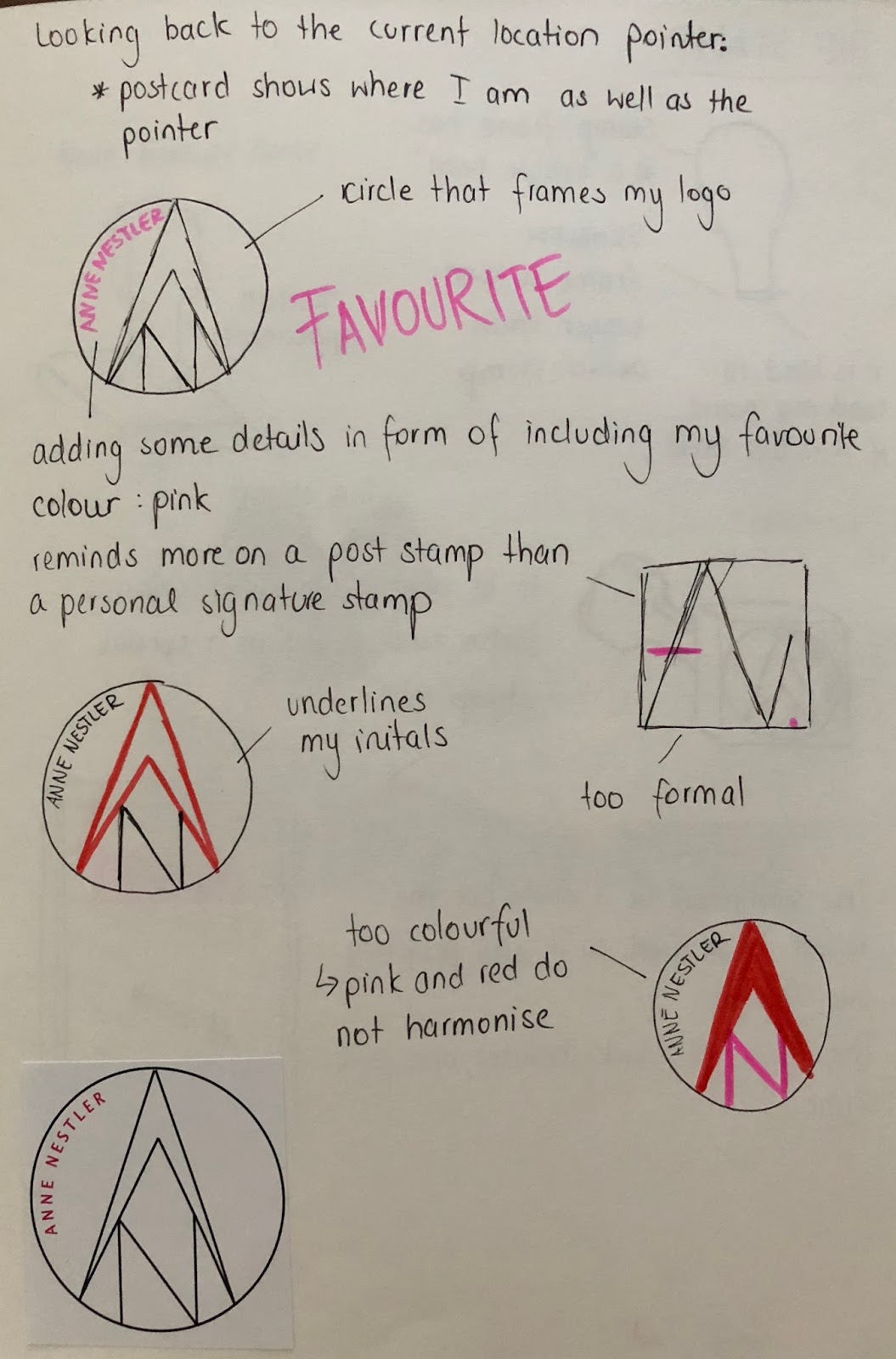
I looked at the aspect that I love to travel and that navigation systems will help me to find my way and point out my current location which is constantly changing.
My idea was to face my logo on the navigation pointer. This shows that I always change my position but the but the one thing that always accompanies me is my current location pointer. This design would promise the client to support them anywhere at anytime just as a current location. It also would increase the value of my products because of that fact.

Afterwords I looked at different environments such as Mountains. I combined my initials which reminded on mountains and adapted it to my personality by including my favorite color palette just as the colours pink, red and black.

Then I thought about the different kinds of transportation people use for traveling such as airplanes, cars and ships. Because I like to travel by airplane I thought about the environment which i can see from the bird prospective. Focusing on mountains I looked at special Layer designed maps and based my next design of those. To demonstrate that I love to travel by plane I included a little plane in my logo.

Afterwords I thought about the products that I am going to design. those designs should have a personal connection to me and should be individual as well as they should include my logo.
Each time when I go on a journey I write a postcard to my friends and family. that is the reason why I thought about creating a stamp in my favorite colours showing my logo.


Then I designed a mug which represents my love for coffee and is always a nice giveaway for somebody’s birthday. my idea is to design a mug which shows my stamp design in context with a map. Referring to that it would convey the aspect of me traveling around the world. for my propose I wanted to use the street name where I lived in back in Germany so which would be the starting point of all my journeys.

To be able to carry the coffee with me I wanted to design a coffee cup to go. The coffee cup represents my identity by using my logo and the city I lived in called Oldenburg. Having the facts I started experimenting with the layout. Jacks Preston promise good quality I thought about a including the phrase: the finest coffee from Oldenburg. As the background colour i used pink.


Then I extended my designs by thinking about the purpose of drinking coffee which is to enjoy, relax and stay awake.
Focusing on the word „relax“ I design some images playing with colour which I also used for further cup designs.


After that I looked back at my brainstorming from the beginning and wanted to include another aspect which I’m interested in, namely rings. I love to wear rings which gave me the idea of combining a world globe with a ting including another logo I designed.

My last design is a phone case. I chose to design a phone case because I am always traveling with my phone to be able to find different locations and specific places. my phone is my navigation system during my journey. Furthermore I use it to take a lot of pictures.
My initial idea was to have a plane phone case which only includes my famous and simple logo in form of the current location pointer. My second I idea bases on my former cup designs which included the aspect of rings. In this case I played with my favorite color palette.


To summarize my process I had to answer following questions.
What inspire influenced your ideas?
I got inspired by the simplicity of logos and symbols because I think that those are the ones who are easy to remember and good to recognize as well as they present my attribute of being organized and structured.
During the whole designing process I focused more on my personal character traits and tried to respond to them by visualization.
How are you answered the brief?
I choose to design four different products which reflect my tastes and show my passion for traveling to different counties.
Those products show my brand which promises quality and reflects customer's value.
What does the brand says about you?
My brand shows clearly the fact that I am a person who likes to go on adventures and is sophisticated. Furthermore it includes my likes for simple colours such as black and striking details in pink. The font style shows my elegance as well as my organisation.
In conclusion helped me this project to understand the meaning of the brand and an identity. It also showed me how important it is to combine the logo as well as product designs with your own personality to convey a specific meaning. Furthermore it helped me collecting my interests and realizing who I am.
Kommentare
Kommentar veröffentlichen