What is the secret that makes a good logo a rememberable sign?
Looking at the harmony between edges and curves helped me to understand why logos harmonize so many times.
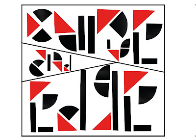
The Modular Type Workshop gave us a kit with different shapes which we had to use. For this task I thought about using some of those shapes and adding a detail in form as a red triangle to it.
Regarding to that the typeface that I would create would attract attention by using a light - dark - contrast, a shape - contrast (curves and edges) as well as a colour - non-colour -contrast (black, white in contrast to red).
I started with looking at different brands and their logos. I realized that they always include a combination from curves and edges which causes a smooth transition within the image.
I also look at some graphics which include a play between the colours as well as curves and edges.
Bansri Thakkar is a student who designed a poster which inspired me.
Then I started designing my own typeface. I wanted it to be simple, abstract and modern at the same time. I handcrafted all letters from the alphabet and photographed them. After that I designed a sheet using Photoshop to place them in the right order and create the final typeface.
Then I looked at my inspiration again and decided to design a poster.
I like my typeface because it harmonizes well together and it shows a contrast between edges and curves in each letter. Furthermore I like the detail of having a red triangle.


Kommentare
Kommentar veröffentlichen