Direkt zum Hauptbereich

Modular Type - One-Day Workshop


This workshop helped me to understand the importance of communicating and discussing in collectives as well as splitting the work to be able to create a harmonizing typeface in a short period of time.

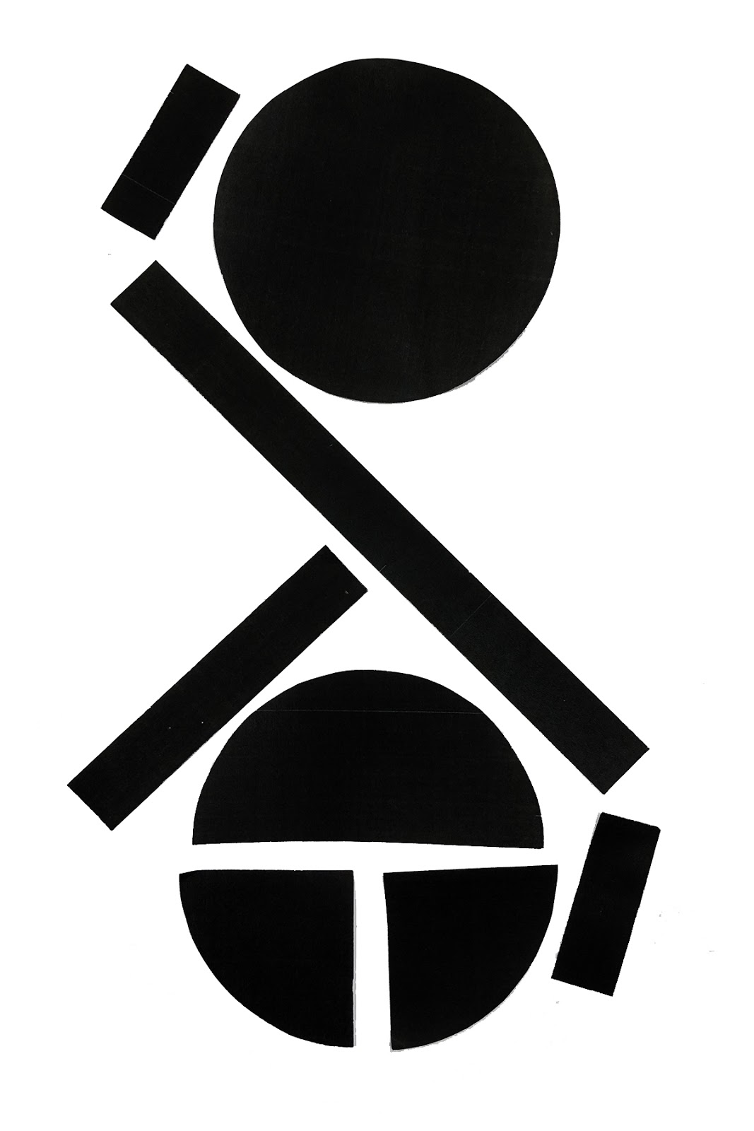
The main brief told us to create 62 glyphs (alphabet upper and lower case, numbers) using specific shapes from a kit.


The first rule that we had to follow was to include all different shapes from this kit. We started our work by dividing all glyphs by 12 group members. For this task we just had to design the uppercase letters as well as the numbers. Each of us had to create 3 different letters/ numbers. 
I came up with designs for the numbers 7, 8 and 9. 


Because of the short period of time that we had to observe it was important to focus and do not get lost in the design of one letter. I managed my time well so I was able to experiment with a couple designs for each number. 

Looking at our groups outcome I liked the unique letters. Evaluating the whole typeface I realized that we would have to talk more about the layout and design so that our letters would harmonize better. However, because we used the same shapes and colours our typeface looked nice already.


Afterwards we were told to design a lower case alphabet. This time I had to design the letters w, x and z.
Because of the fact that the letters have to harmonize as one typeface our collective decided to include the negative space, too. Regarding to that our lowercase letters harmonize as one typeface more than the uppercase letters which we created earlier.


Then we got another brief which told us to design all of the 62 glyphs by using only two shapes. Those letters also have to fit in a grid that was given to us.


The letters and numbers ended up to be very abstract. The importance was to think of characteristics of each letter so the brain would automatically fulfill a letter/ number by seeing only two shapes in the right order.
I realized that this task was even tougher than the one before. It is easier to include rather more shapes than to forgo some needed ones.

After that I could refine any letters or numbers from the whole day using the amount of shapes that I want to.


Finally, I designed a design sheet for todays task including the collective work as well as my own refined but still abstract numbers.


Kommentare

Beliebte Posts aus diesem Blog

British Values - Individual Liberty

The country Britain not only stands against terrorism and discrimination but also fights against those issues to protect society. The Prevent Strategy was set up in 2006 by the government to stop people supporting terrorism or becoming terrorists. The strategy is subdivided in three major aspects which are challenging the ideology that stands for terrorism, protecting innocent people and supporting those sectors which have a risk of radicalization. To prevent that young adults or even children turn into terrorists the government developed the Equality Act in 2010 which tackles inequality and prevents discrimination against people with 'protected characteristics' inside public schools. Examples for 'protected characteristics' are the age, disability, sex or sexual orientation, the religion, etcetera. In fact of that the British Values are defined as "democracy, the rule of law, individual liberty and mutual respect and tolerance for those with differe

Portfolio

Designing a great and unique portfolio is one of the most important things to get into a good university or a job. The main aim is to show the best of my work. Regarding to that it is not just about final outcomes but also about experimentation and variation. A good portfolio reflects you as a creative designer, your knowledge about techniques and you  variety . To show that it is necessary to think about the layout and the typography representing your best works. The placement of your images and the scale of them also needs to be considered to make a good impression.  Basically your portfolio is a vital element that shows  your   ability of  conceptual thinking. This past week I concentrated on designing the most Strong portfolio I could create. To be able to that I was looking at all my work that I have done during the last few month choosing the strongest ones. I included different techniques to show off my knowledge and way of experimenting. Furthermore I included s

Create Your Identity

This project helped me to understand what a brand is and how to develop one. Before I started creating a brand which shows my own personality we had to answer a couple questions in collectives. What is the purpose of a brand? Answering the question a brand creates an identity, makes a company unique and recognizable as well as communicates value and quality to the customer. What is an excellent example of self-promotion and why? The brand NIKE is well known around the world and promises the company's value of their products. Because of NIKE having symbiotic relationships with for example celebrities the brand promoting itself to a wide range of people. Is a brand a company, a product, or a person? Discuss and state why. A brand is everything at ones. Basically is a brand developed as soon as somebody or something owns something. For instance a musician who own its songs. When this person decides to create its own collection a brand starts to grow. How do