How can sound influence me for designing a typeface?
The brief ask me to respond to various soundbites though drawings considering shape, form and size. Afterwards I had to look for letters in my recently designed images and produce a range of typefaces.


At first I was skeptical about finding any letters in my drawn sheets. However, I was surprised that I could find the whole typeface in capital as well as lowercase letters in two of my drawings.
Regarding to that I learned that my produced typefaces were responding to the soundbites which I really liked. Furthermore I liked to practice another way of experimentation and came up with a typeface that I would not have designed in any other way.

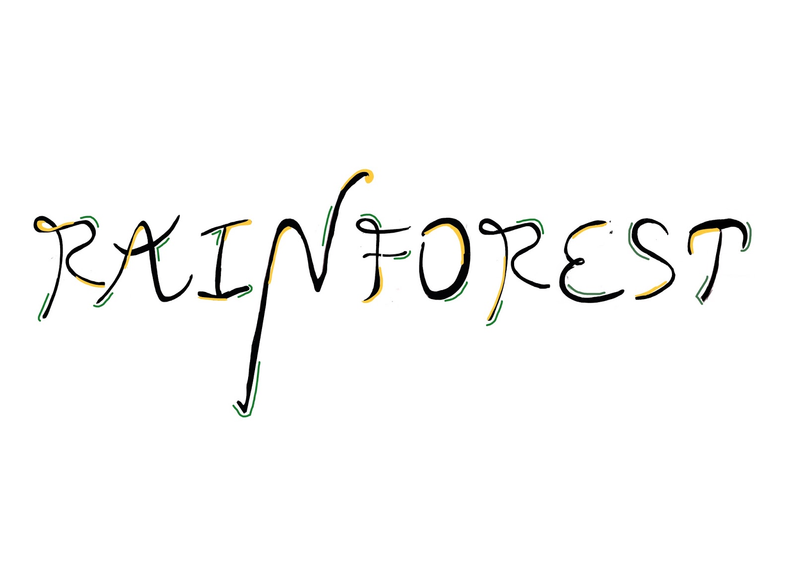
After that I choose one of my designed typefaces and refined it via Photoshop. Referring to that I added the colours yellow and green which respond to the chosen soundbite that reminded me on the rainforest.
Because of that I learned how to develop my ideas further. I wrote the word RAINFOREST using my designed font style as well as the sentence: " I am Anne from Germany" to get a better understanding of the actual design in some context.

To Design a printed poster advertising an exhibition I thought about the name of the exhibition, a short body text summarizing the it, the date and time of the exhibition as well as the venue.
RAINFOREST exhibition
Explore the diversity and beauty of the Rainforest by looking at various artworks from popular
artists. Submerge yourself in a colourful and peaceful world.
February 2018
Tate Modern, Bankside, London SE1 9TG
Afterwards I looked at some artists to come up with various ideas. I choose to respond to one of David Carson's artworks in which he uses a lot of layers, handwritten letters and different colours because it reminded me on a rainforest which is crowded with trees, bushes as well as animals. I also thought about the layout of my body text which should look like rain or liana. Jean Widmer inspired me with his use of laying out and including a short paragraph.
To transfer my ideas into visual designs I used different techniques such as sketching, handwriting and scanning. To combine all those methods I digitalized my handcrafted images and used Photoshop as well as Illustrator to edit and define them.

 (David Carson)
 (Jean Widmer)
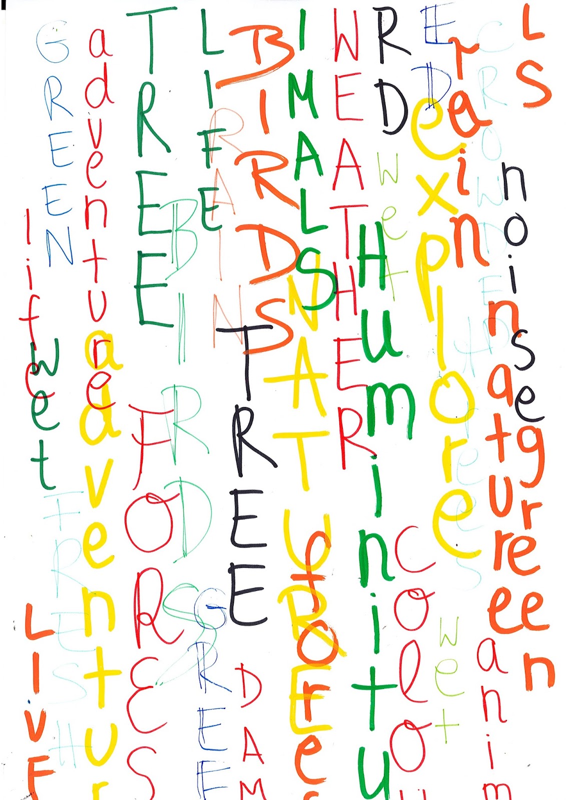
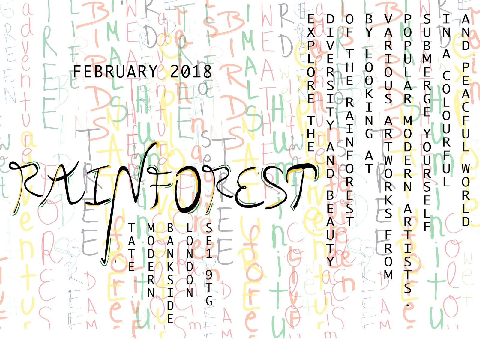
David Carson's use of layout as well as having a background photograph inspired me to design another poster. My typeface reminds on calligraphy and is therefore arty already. Because of that I combined it with a simple font and payed attention to the kerning between the letters which are going vertical and horizontal.

Looking at my outcomes I liked the fact that they look unorganized and crowded as well as they include different colours because that is the message which I wanted to express.
However, both of my posters are hard to read. One the one hand because of the layers and on the other hand because of the layout of the words.
Referring to the project's brief to design an exhibition poster I think that one important issue to implement with my designs is to have a well readable outcome.
Because of that I started experimenting with those posters to define them by changing the background, looking at different colours as well as the layout of my posters until I was happy with my outcome.


To have another influence and create various posters which I could choose the best one from I looked at other artists like Jimbo Barbu, Morgane Planchenault and Darya Kobozeva who inspired me to deform my background. Because of the fact that I connect the colour green with the rainforest I used green instead of black as my letter design and orange as my background.
I liked the fact that my design conveys the feeling of something different and unexplored as well as the feeling of an unstructured nature by having an asymmetrical background.
To refine my poster I wanted to use the Risograph to increase the strength of my message and to underline the fact of an art exhibition by using a special print method. Furthermore I thought that the outcome would be more striking.
 (Jimbo Barbu)
 (Draya Kobozeva)
 (Morgane Planchenault)
My last design is inspired by Joel Holland and his book cover design for the novel "Ice Chorus" by Sarah Stonich. I like the simplicity in his design.
The different paint spots include colours which I am connecting with the rainforest. It also expresses the different artworks and modernity that is shown in my exhibition.
 (Joel Holland)
To evaluate my whole process I am happy with my time management as well as my outcomes. I designed various posters inspired by different artists and defined them. To have a great final artwork I payed attention to the layout, the shapes, spaces and colours of the words and the background regarding to the feelings that I wanted to express.
Looking back at the beginning I was surprised that I could design a lot of posters basing on one drawn sheet of paper responding to a soundbite.
However, I was not happy with my typeface in the beginning because I rather prefer a solid and modern than a calligraphy font style.
Kommentare
Kommentar veröffentlichen