We started the project by going together in collectives of three.
What are the problems of the current wayfinding system in North Greenwich?
To answer this question we created a questionnaire with open and closed questions to ask several people walking around North Greenwich.
We looked for all different characters to have a wide range of interests such as station workers, visitors, tourists and students.
In the beginning it was hard to find people who were willing to answer our questions because they either were not interested or were in a hurry. However, we were able to collected several opinions.
After our short trip we evaluated the answers and came to the conclusion that the current way finding system had a lot of lacks that should be improved.

To be able to improve the whole system we brainstormed all the current problems and started thinking about the improvements.
The way finding system in North Greenwich appeals to workers, students, visitors, tourists and disabled people like blind persons.
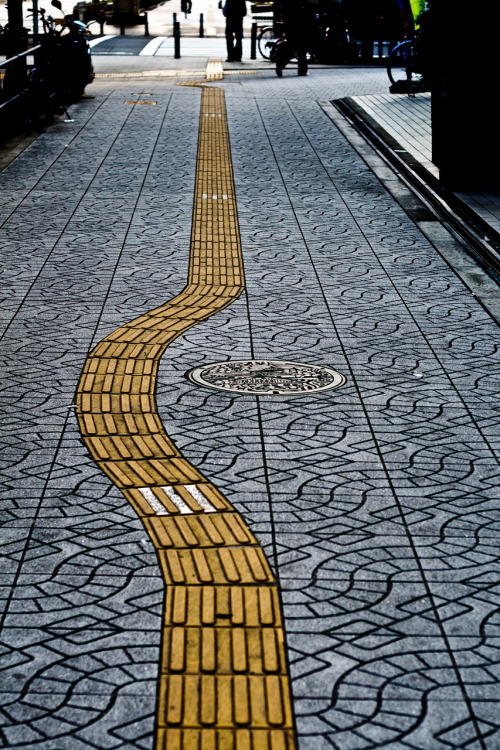
Our idea to adapt the system we thought about a bright coloured and textured coded system. Those colours and textures would express the different destinations and people would be navigated by foot prints including those details. Because a lot of tourists from different countries are visiting North Greenwich we thought about using symbols which are international and therefore generically legible like the foot prints.
The current signs are not obviously which means they are too small, have neutral colours, the font is not bold, they are placed at hidden spots and there are not enough signs in and around the station. Regarding to that people do not find the way right away but mostly ask workers for directions. One problem is also that the Station has a lot of different exits and it is not obvious which way to exit to get to the destinations.
To make the signs more eye catching we decided to use bright colours, bold font and a big sized sign placed in the middle of the station.
Another problem which could appear in our system is the readability of the foot prints at night. To provide chaos during night events at the O2 we decided to use glowing colours.

To refine our idea and to be able to visualise our idea I researched currently existing navigation systems facing colours, symbols and floor stickers.
The first system I liked is designed by the Japanese Architecture Firm Nikken Sekkei for the Tokyo Narita Airport and shows different colours running track that navigates people to the departure and arrival airplanes.


Similar to this design is the wayfinding system at the Underhub Language School by Emil Dervish. The floor is decorated with colourd lines that lead to different rooms. Regarding to this everybody is able to understand the system.


Studio SC designed a system for the children's hospital in Seattle in which they navigate people using symbols and images. To make it look nice for children they used different colours and wall drawings. Each level has its own symbol and matching drawing to it as well as a colour. The symbols and colours are international and children are also able to read them.
Another wayfindig system that uses colours and symbols is used for a Sport and Entertainment Complex in a Hotel. This system is designed by Tomatodesign.
The symbols are placed on the walls and errors lead the direction to each room.


To find out how we could also navigate blind people I looked at existing systems focussing on this issue. Most of the time textures on the ground lead people to destinations and especially beware them of stepping on a street.


To focus on our audience in detail my collective peer looked at Blind people and what points needed to be considered when designing a system. Regarding to that it is necessary to consider the lighting, colour, texture and functionality. Special colour combinations are hard to identify for some people with a debility of sights. The texture must be easy to identify and the symbols should be basic and easy to understand for everyone.
Tourists on the other hand might not speak English so the system should include international symbols and should be simplified so everybody understands it.
After that we drafted our initial Idea including the main sign, colour palette, symbols and foot prints. And named our wayfinding system "STRIDE" which refers to the foot prints.

To implement the idea into real outcomes we split the task. My part was to design the actual sign including the map, text, braille and then later on placing the symbols.
I wanted to design a modern large sign which is eye catching but also fits to the North Greenwich Station. It should be a double sided sign placed in front of the escalators so that people arriving are able to see it. Because of its big size people in second rows would also be able to read the sign. The Braille for blind people is a meter above the ground so everybody is able to reach it.
The sign is a non digital installation which saves costs and does not harm the environment.

Looking at the map I simplified the whole outlines by only drafting the main destinations and the most important streets to know how to get there. The buildings in the map are colour coded so they are easy to identify.

The symbols were designed by my collective peer and bases on the origin colours of the destinations but bright. That means that Ravensbourne is coloured in blue as their symbol and emirates river bus services in red. Because of that people do not get irritated by non-matching colours. We also tried to break the symbols down as much as possible so that every tourist could read it.


Afterwards I added the symbols on the sign. And placed the braille on top of it.


Designing the foot prints we thought about the different textures for the destinations. For example the Ravensbourne building which includes a lot of triangle. Basing on that we decided to use this texture in the foot prints that lead to the university. The usual tourists would be navigated by the colour blue.
Because the colour is glowing people are also be able to see the foot prints at night.


After we had finished our project we presented it in front of a large audience and tried to convince them of our idea.
After that we got positive feedback and some points to improve. Even though we included texture in our foot prints blind people would have trouble to get navigated by it because the prints are spread out. Improving this issue we came up with the idea of having the textures in thick lines to that blind people could follow them easily. To navigate tourists we would still attach foot prints to the floor but then they would not have the textures directly included.
Furthermore we needed to place the actual sign in several places like the river bus stop because people are not only coming from the North Greenwich station.

Kommentare
Kommentar veröffentlichen