This life project was different from the project we had worked on before. That is because the project brief is written by an existing company called Art Fund which wants us to create a campaign in their name that can drive sales of the student art pass amongst university students. Because of that we had to follow guidelines such as using their colour palette, font style and layout.
The brief also gave us key insights in students lives as well as the key message which had to be express through our design to make the concept clear.
I started with writing down the main aspects which the student art pass offers and what the company wants me to convey.
Then I listed facts which needed to be considered for my campaign.


My first idea was to design the student pass out of error windows which appear on the computer when an error happens.
This idea was caused by the thought that students are mostly using computers and phones and are all of their free times online.

My second idea was inspired by a campaign which uses different materials for showing the same image such as a cigarette made out of LEGO, Lino or a sketch. I thought that I could design posters showing the student art pass, made out of different materials, and place those posters anywhere where students go for example buss stops or tube stations. Because of the uncommon material students would be attracted by those posters.

After I looked at different advertising books I realized that all great adverts catch attention by showing something that seems odd. I liked the idea of combining two totally different things to create an odd picture that refers to the student art pass and would catch attention of students.

Another idea I had was to design a stamp which I could place anywhere. This stamp should include the product student art pass, the amount of money students would have to spend, the link where people can buy it and the company’s name.

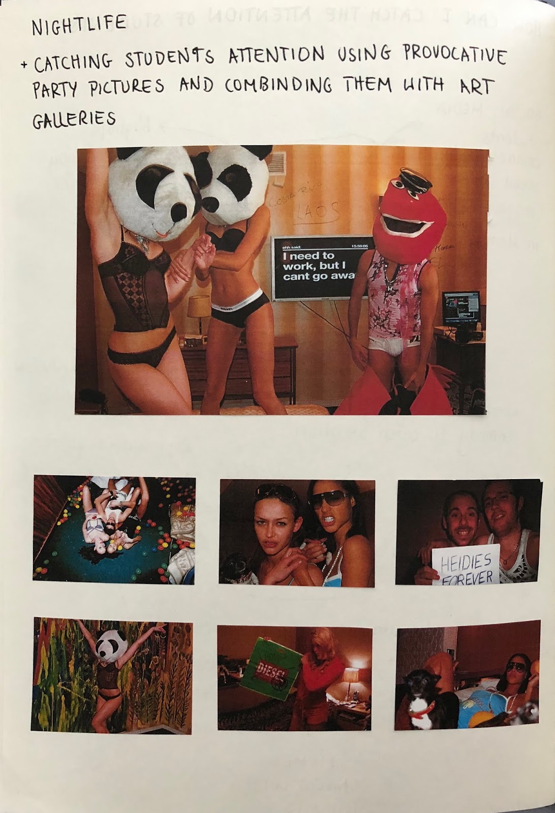
For my last idea I started to brainstorm student’s interests to be sure that I would reach my target audience in my design.
I noticed that most students love going out, doing sports and spending their free time on social media.
Regarding to that I wanted to design a meme which would combine comedy with art. This should be posted on Instagram, Facebook, Twitter and Tumblr so the campaign would actually be able to reach as many students as possible.
In those Memes I wanted to combine nightlife with galleries to attract attention.
Furthermore, I brainstormed funny quotes which could be used as Meme phrases as well as I did some research on current existing Ones.


After that I thought about the layout and what needs to be included such as the name, price and the reference where students can buy the pass. Regarding to that I designed a layout.
Furthermore, I wanted to include the reference in the comments because then people would be able to click on the link and get directly to the site to buy the pass.
Before I designed my final outcome I looked at the restrictions from the company again which told me to use a chosen font style, color palette and logotype. Then I came up with funny and catching phrases for my memes and thought about how to combine them with photos that link to the pass.
Because not every student is interested in going out I thought about other interest of students which is for instance going to the gym and doing exercise. Regarding to that I looked at Memes which express the issue of sports.
Afterwards I sketched a post showing the layout of the appearance of my design after its posted on Instagram.


However, I got lost in designing the meme so the outcome would not really refer to the student art pass and therefore it would not sell the product. Furthermore I was not really happy with the appearance of my design because it was basically a blank meme instead of a graphic design product which would sell the student pass.
Referring to that, I gathered some more phrases which would relate to the product and would be funny to include in a meme.

Additionally, I took photographs of the student conveying the feeling which the phrase of the meme expresses. For example, I combined the phrase: “when you spend a fiver on 240 galleries cause the offer is just to good” with a picture of a guy looking happy in a funny way.

Another example is the phrase: “when you realize you spent 12 pounds on one exhibition instead of buying the art pass for 240 galleries for fiver” which is in combination with a picture of a student looking annoyed.

Even though the sentences sell the product now, I was not happy with the design. That is because the design looked too boring and is not the company’s style so student would not recognize it.
To improve that I wanted to create a short story by connecting three different Memes.
The first meme should show a person who spent too much money on a gallery and regrets it.
The second meme should show a person who is really happy because this person saved money by buying the student art pass while his/her friends needed to pay the full price. I chose to include comparison with friends because student always compare each other.
The last meme should be a picture of the student art past to make the product clear.
My inspiration on how to combine all those Memes is based on the art fund website.

Looking at this picture I had the idea to combine three Memes drawing a line that connects the product’s name, written on the first meme, with the company’s name, written on the last meme. My inspiration for the colours are based on the colour palette used for the company’s product already.
However, I experimented by including some other colours such as pink.

I like the Memes with the black writing that only included yellow and blue because they where easier to read. Even though I preferred the last meme showing the student art pass on a pink background as it is more striking.
Therefore I used the first two memes with the black typography and the last one with the pink background. Then I created a mock up on how my outcomes would look like after they are posted on Instagram.


Kommentare
Kommentar veröffentlichen